The SEO Lie Factor
One of my current projects has the goal of creating a series of charts and graphs that would allow my SEO team to intelligently show progress of client projects. Sure we could, just like everyone else, show rankings and traffic, but I'm looking for creative ways to combine data to provide deeper insight. This got me to thinking about the lies often associated with SEO statistics.
The trick with graphs is displaying accurate information. That goes beyond just using accurate numbers to power the graphics. It also involves looking at the end result with a critical eye and asking, “How might someone misinterpret this?” While thinking about this I've come to the conclusion that 3D graphs, although pretty, are the most likely to result in false impressions.
Take for instance the common 3D pie chart I've shown below.
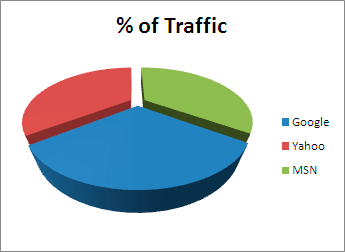
What is your first impression about the % of traffic coming from Google (blue pie piece)? You're probably inclined to say that the percentage for Google is about double that of Yahoo and MSN. That impression is a result of my use of a 3D perspective which I purposefully manipulated to inflate Google. The underlying data though has Google at 0.3% with both Yahoo and MSN at 0.35%. The data is accurate, but my portrayal of it is deceiving.
Here's another example using columns.
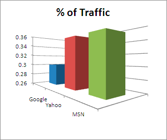
This time around I adjusted the perspective and put MSN up front to make it look like MSN delivers what looks like almost 3 times the traffic of Google. Using a non-zero scale also amplifies the perception of MSN's dominance. Again the underlying data has Google at 0.3% and both Yahoo and MSN at 0.35%. Anyone quickly glancing at this graph would surely be tricked in to believing that MSN is a much more important player than it actually is.
Edward R. Tufte, the author of The Visual Display of Quantitative Information calls this the Lie Factor and even provides a simple formula for calculating it:
Lie Factor = size of effect shown in graph / size of effect in data x 100
In my first chart the the lie factor is 6 and in my second chart the lie factor is 2. For reference, Tufte says that, “a lie factor greater than 1.05 or less than 0.95 indicates a substantial distortion, far beyond minor inaccuracies.”
I used to favor 3D graphs in the past up until a client came right out and said to me that one I had created was confusing. I realized at that point that “confusing, but pretty” just isn't a good combination and I've been on the 2D graph bandwagon ever since. However, it's only during my most recent efforts to create new ways of visualizing SEO project performance that I've thought about the many ways that people create deceptive charts and graphs. Whether you're doing SEO in-house or using the services of an SEO agency, beware of the lie factor. That is, unless you're one of my clients in which case just nod your head and pat me on the back for a job well done!

Well I like those charts, charts in general. No seriously, I like this post a lot- the more visual kinda type you are the more important are such charts getting.
Should've titled this post "Juking the Stats" in honor of The Wire :)
http://www.youtube.com/watch?v=_ogxZxu6cjM
Very good post ... it got me thinking about charts a bit, thanks!
Jorge,
People respond to charts. A properly constructed one that tells a good story makes clients feel good about spending the money they are spending on their campaign. Half the battle in my industry is perception and the right charts can help a lot in that area.
Do you really need charts? And what do you need them for? To understand the data or for marketing purposes (the report looks better)? Tufte says there are good ways and bad ways of displaying the data. Others say it depends on the "rhetoric situation" (meaning know your data, know your audience, know your goals).
I just wrote a post on the "lie factor" and other Tufte's principles. It may interest you.
Joost,
The pat on the back is just a suggestion. I've yet to have a client do so. They're more inclined to say, "Yes, tripling our web site conversions in just a few months is good, but how come we're not ranking #1 for xyz generic term?"
We used to put the data next to the graph or right under it to show the hard numbers and people would not be deceived. But clients were still confused. After a while we figured out that when there is a graph, people don't look at the numbers anymore.
Now we try to limit the use of graphs unless there is a good reason for it.
NB: clients actually pat you on the back? Our clients only give us drinks and then try to avoid paying the invoice ;)