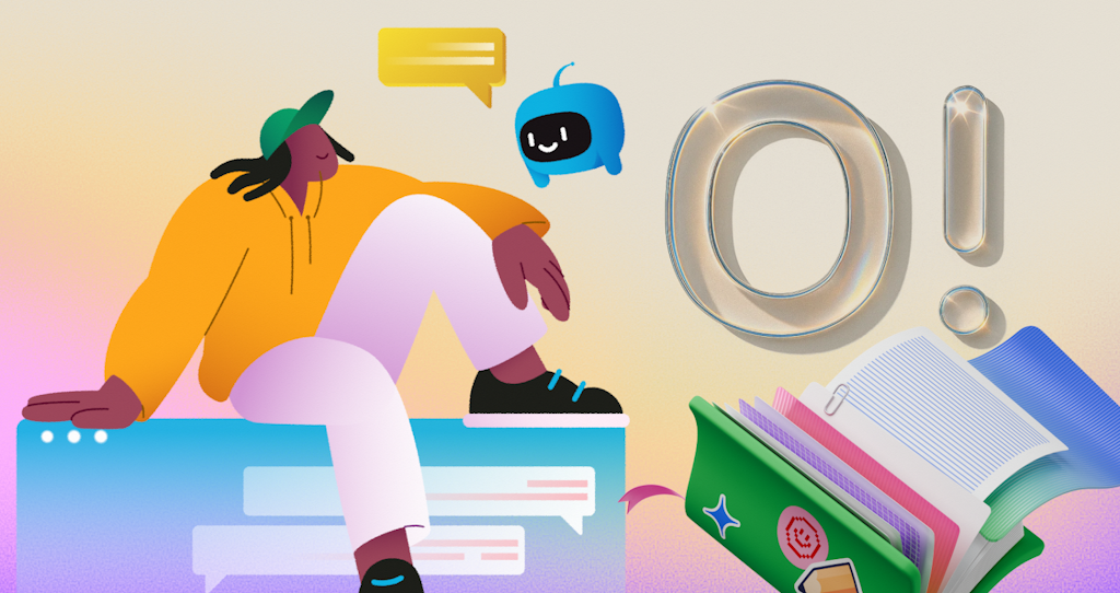
Ouch by Icons8: the style library that behaves like a system
Executive summary
You want one visual voice across product, web, email, docs, and ads. You also want to ship on schedule. Custom art for every screen does not scale. Stock pictures clash. Ouch solves that gap with style families. Each family is a small visual language you can adopt in a day and extend for months. The payoff is simple. Screens stop looking stitched together and start reading like one product.
What ships in the box
Ouch groups artwork into coherent styles. Inside a style, characters, objects, and backgrounds share proportions, line weight, spacing rhythm, and color logic. Pieces combine without seams. You get hero scenes for landing pages, mid scenes for explainers, tiny spots for empty, error, and success, plus neutral backdrops that keep layouts tidy. Files arrive as SVG when you need control and PNG when you need a drop in. Both hold up on dense displays.
How teams actually use it
Product design. Empty states get a small spot and one clear action. Onboarding turns into three beats: start, progress, success. Feature pages borrow a mid scene that hints at the job to be done. You keep copy close to the art so meaning travels as a pair.
Marketing. A single hero anchors the campaign. Crops are ready for square, vertical, and horizontal frames. A recurring character or prop carries recognition across channels. Email uses PNG with tight compression. Social gets the same idea in different ratios.
Docs and help. Complex steps get a compact scene next to the callout. No ornamental fluff. Visuals earn their keep.
Fit inside a design system
Treat an Ouch style as a subsystem next to type, tokens, icons, and grid. Give it a stable home and a one page rule set.
/brand/visuals/
/ouch-style-a/
README.md
tokens.json
hero/
scenes/
spots/
backgrounds/
The README explains placement, allowed crops, export sizes, and reserved uses. The tokens map binds fills and strokes to brand colors so theme changes do not require new exports. Store assets next to owning screens. Name them by owner, not by vibe.
Choose with evidence, not taste
Build four real screens with your copy and layout. Swap only the art.
- homepage hero
- pricing callout
- onboarding step one
- one empty state in product
Show two candidate styles to five people who do not work on the project. Ask each for three adjectives. Keep the style that matches your voice guide. Archive the other set. Decision in one afternoon. No mood boards. No debates.
Starter kit that unblocks delivery
Freeze a tiny kit for the next release so every ticket uses the same blocks.
- one hero for site or flagship feature
- two mid scenes for product and content
- three spots for empty, success, and error
- one background that pads layout without stealing focus
Mid project, teammates will ask where to browse and confirm coverage. Park a clean pointer right where they will look during review: illustration.
Accessibility that survives code review
Images help only when everyone can use the page. Build checks into pull requests.
Alt decision. If the image carries meaning, write a short alt that states the idea. If it is decorative, use empty alt so assistive tech skips it. Inline SVG should include a concise title and, when useful, a description.
<svg role="img" aria-labelledby="t d" width="512" height="256">
  <title id="t">Team defining analytics goals</title>
  <desc id="d">Colleagues move charts and sticky notes while another checks results</desc>
</svg>
Contrast and state. When artwork contains text or uses color for meaning, follow WCAG 2.2 ratios. Tie fills and strokes to the same tokens used by alerts and buttons so success and error read the same way in art and UI.
Representation. Prefer inclusive characters and everyday activities. Avoid clichés. Test with a small group that reflects your audience.
Performance that holds under traffic
Pictures are heavy. Treat them like code with a budget.
- prefer SVG when texture is not essential
- export PNG only at the size you render
- always set width and height to prevent layout shift
- lazy load below the fold
- measure Largest Contentful Paint on real pages
Responsive raster without a framework:
<picture>
  <source type="image/avif" srcset="/hero-ouch.avif 1x, /hero-ouch@2x.avif 2x">
  <source type="image/webp" srcset="/hero-ouch.webp 1x, /hero-ouch@2x.webp 2x">
  <img src="/hero-ouch.png" srcset="/hero-ouch@2x.png 2x" alt="Colleagues reviewing analytics" width="1280" height="720" loading="eager">
</picture>
Inline SVG tied to a theme variable:
<style>
  :root { --accent: #2563eb }
  @media (prefers-color-scheme: dark) { :root { --accent: #7c3aed } }
  .hero [data-accent] { fill: var(--accent) }
</style>
<svg class="hero" role="img" aria-labelledby="a b" width="480" height="240">
  <title id="a">Growth chart trending upward</title>
  <desc id="b">Line rising across a simple grid</desc>
  <path data-accent="" d="M10 200 L120 140 L220 160 L360 80" fill="none" stroke="var(--accent)" stroke-width="6"/>
</svg>
Role based playbooks
Web and UX
Use imagery to clarify intent. Empty states carry one action and a short line of copy. Onboarding reads cleanly as start, progress, success with the same cast and setting. Convert SVGs into components in your design tool and link fills to color styles for fast theme flips. In tight layouts, choose a small spot over a busy scene.
Marketing and SMM
Build a social grid with square, vertical, and horizontal frames. Pre crop scenes to those ratios and store the variants next to the brief. Keep one recurring character or prop across the series for recall. Email uses PNG with thoughtful compression because clients still vary.
Developers
Version artwork in the repo. Keep assets near the component that renders them. Inline SVG lets you react to theme toggles with CSS variables instead of exporting new files. Do not put heavy imagery on the critical path. Animate vectors when motion is required.
Education
Ouch works in class and in LMS. Students learn hierarchy and rhythm by remixing scenes instead of drawing from nothing. Provide a style pack, a fixed palette, and three target screens. Store license receipts and attribution notes in the course repo so portfolios remain compliant.
Startups and small businesses
Pick one style and freeze it for a quarter. Apply it to site, deck, store listing, and the top product screens. Cohesion today. Custom scenes later for signature features.
Governance that prevents drift
Add a checklist to pull requests.
- alt text present when needed
- decorative images marked correctly
- dimensions set to avoid layout shift
- file size under the page budget
- LCP verified on the target page
Small rules beat large refactors.
Metrics that prove value
- payload share from hero art before and after a switch to SVG where viable
- LCP trend on the main landing page after rollout
- number of review flags for inconsistent imagery across three sprints
- hours from brief to first approved mock for a campaign
Limits you plan around
- niche scenarios sometimes need a composite from parts
- motion still lives in your animation stack
- large catalogs slow teams without a simple decision rule
Licensing and record keeping
Icons8 publishes clear license terms. Free plans usually require credit. Paid plans remove attribution and expand use. Read the current policy on the publisher site. Save receipts in your brand folder. Track where each asset ships. When legal asks, you have the trail.
Bottom line
Adopt one style. Build a compact kit. Wire it to tokens. Enforce accessibility and performance at review time. Ouch gives you a visual language that ships on schedule and looks like it was designed on purpose.
References
- W3C WAI documentation for WCAG 2.2 on text alternatives and contrast
- MDN documentation for SVG accessibility and embedding
- Web.dev guides on responsive images and image performance
- NN Group research on visual communication and comprehension in UX
- Illustration guidance in Shopify Polaris and Google Material Design

 (2 votes, average: 2.50 out of 5)
 Loading...
839GYLCCC1992
Leave a Reply